Samsung C&T Raemian home
Residents of a premium apartment brand wanted advanced features, but not a complicated screen. I redesigned the home automation interface around that tension.
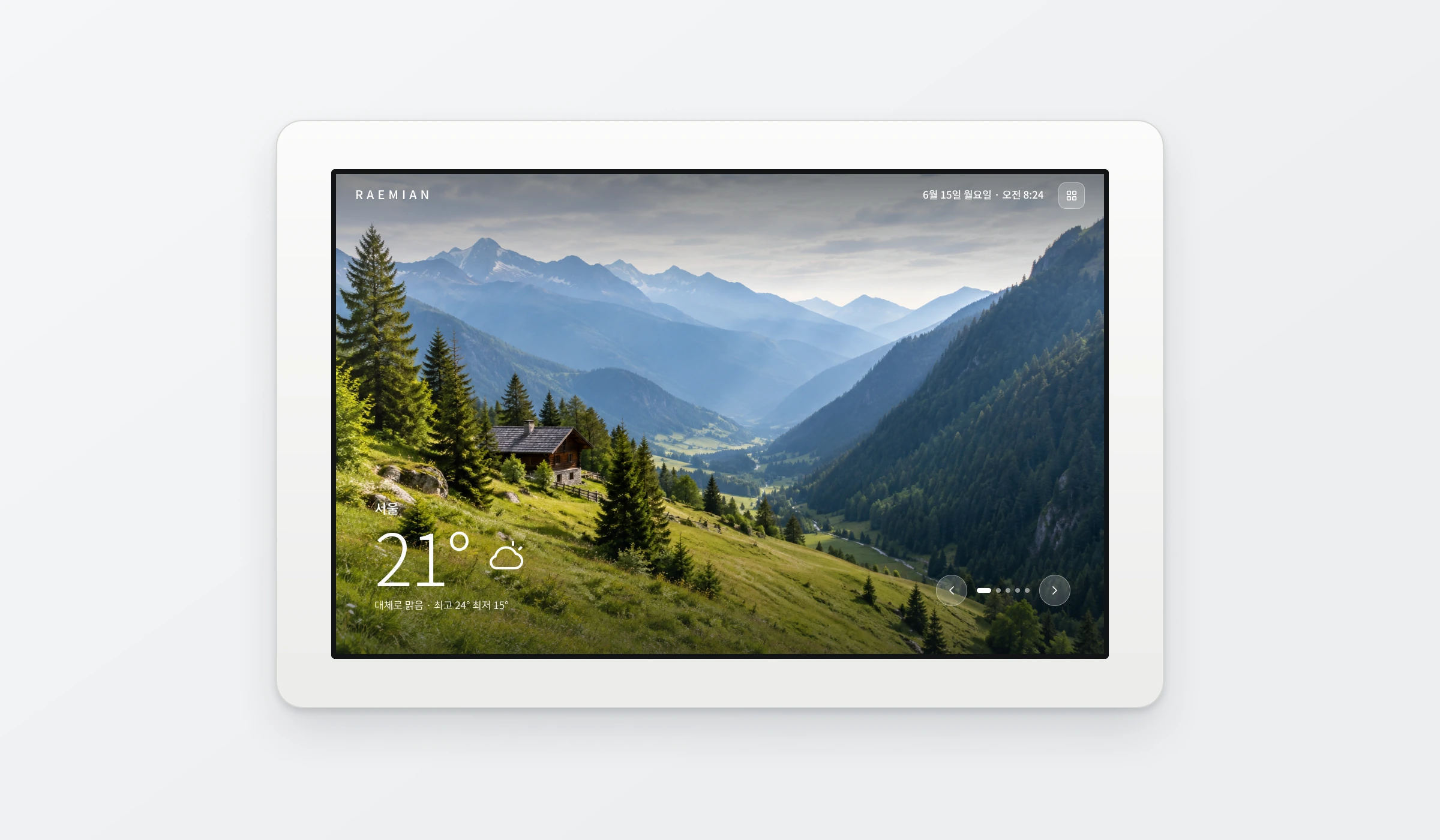
Raemian’s home automation range dated from 2005. It had to support new technology and habits without losing its premium identity.
Took part in research in a model home, and designed the UI/UX for the home automation displays.
A simpler two-mode interface, refined through testing, implemented in Raemian apartments and reused in later projects.
Context
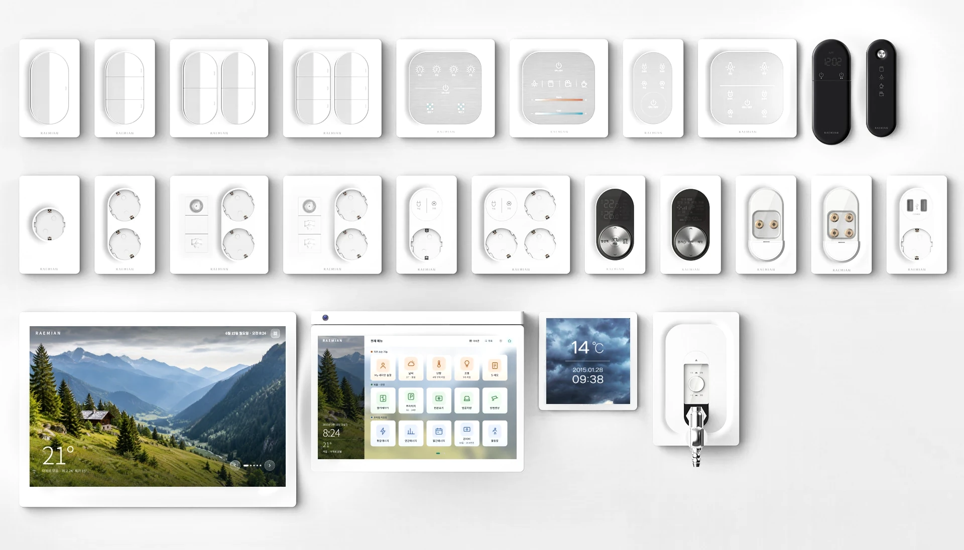
Samsung C&T wanted a unified design for Raemian’s home automation displays, switches, sockets and other electrical products. The six-month project covered research, design, mock-ups, prototypes and design guidelines, with studios in Seoul and London working together.
My part was the home automation system: I took part in the research into how residents used it, and designed the UI/UX for its two displays. The switches, sockets and other hardware were designed by the wider team.
The problem
Residents wanted a premium product with advanced features, but hesitated when faced with too many options.
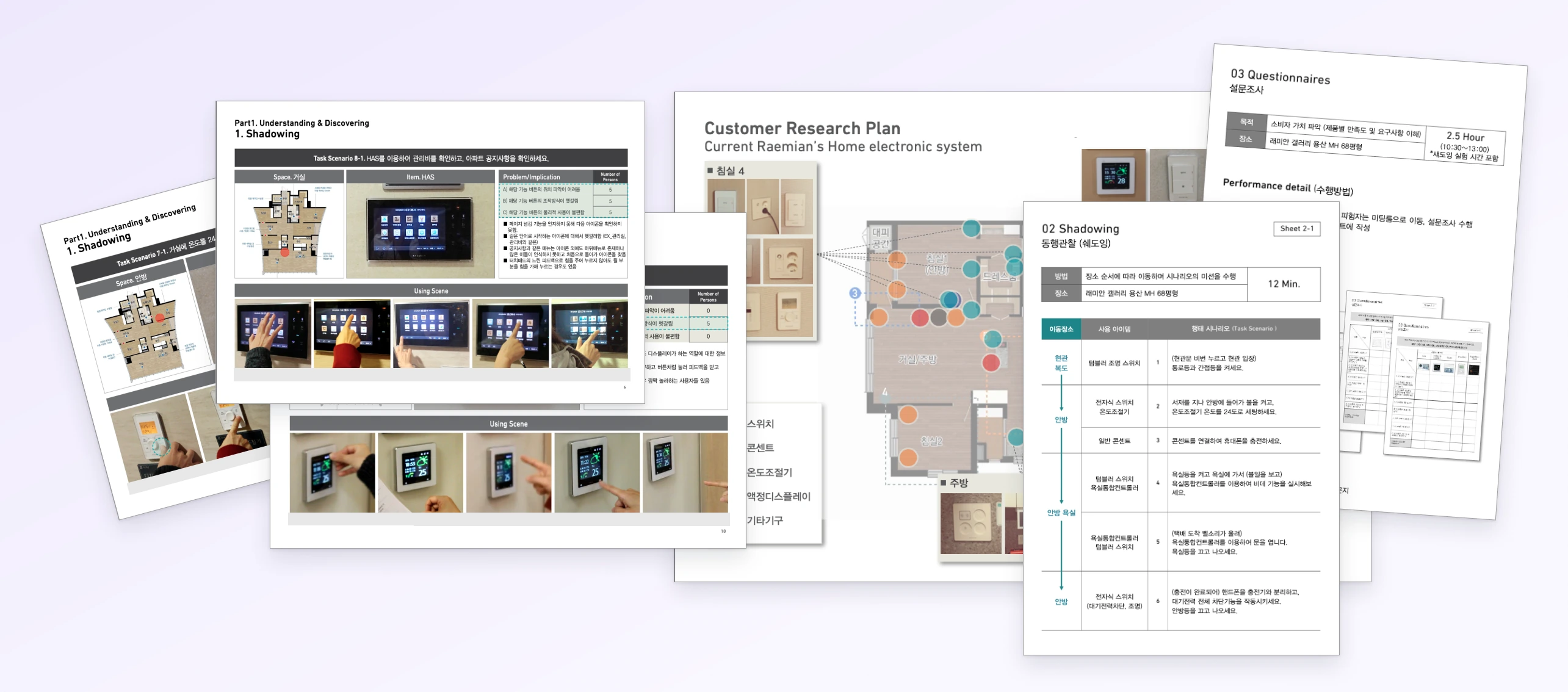
We asked residents to complete tasks in a model home, timed them, then interviewed and surveyed them on the spot. Four findings stood out:
- Controls were hard to find. Overlapping labels and awkward physical controls caused confusion.
- Slow feedback caused doubt. Delayed touch responses made people press harder.
- Ease beat features. New features were welcome only when they were easy to understand.
- Usability was part of the brand. Residents expected interactions as refined as the hardware.
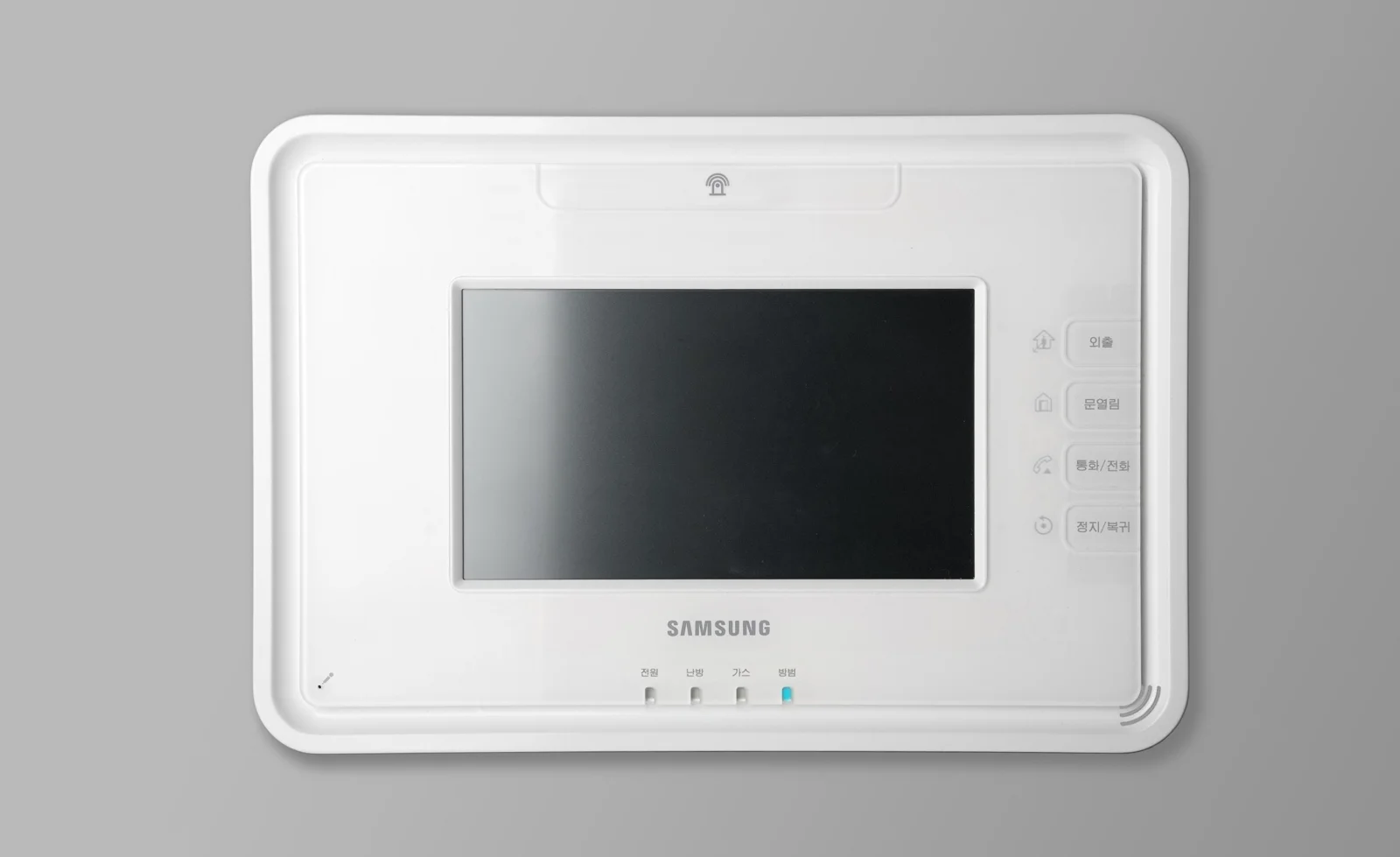
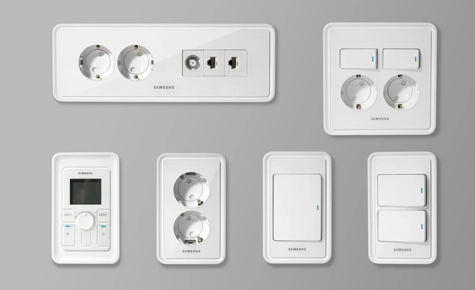
One wall pad serves the whole household, from children to grandparents. Building on universal design work from earlier projects, we set clear rules for the screens:
- Large type. Key numbers and labels are readable from across the room.
- Strong contrast. Text always sits on solid or darkened backgrounds, never directly on a busy photo.
- Big touch targets. Tiles, buttons and toggles are sized for a fingertip, not a cursor.
- Never colour alone. Every group colour comes with a text label.
This is why the interface feels easy to use: residents never have to look for something, read small print or guess what a colour means.
My role
- Took part in user research for the home automation system: model-home tasks, interviews and surveys
- Turned findings into design priorities for the two displays
- Designed the UI/UX, information architecture and icon language
- Iterated through multiple rounds of testing in the model home
- Worked with visual, hardware and engineering teams across the Seoul and London studios
Key decisions
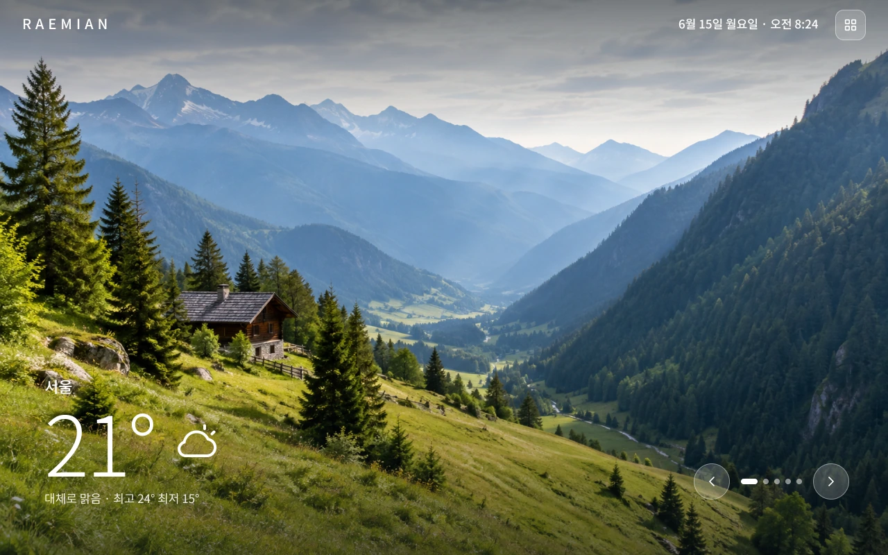
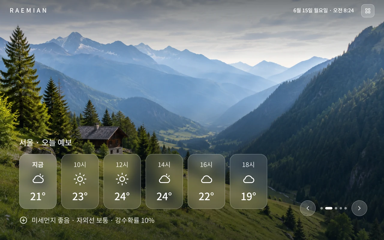
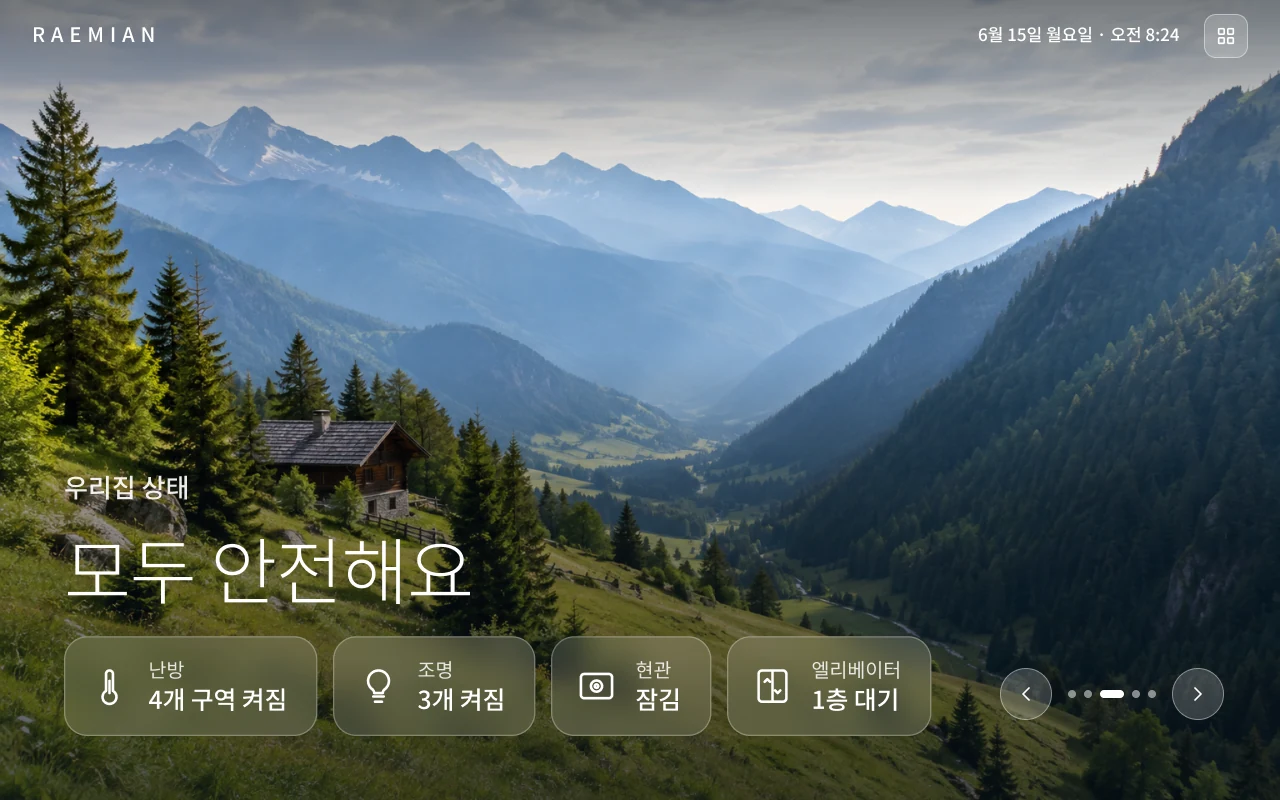
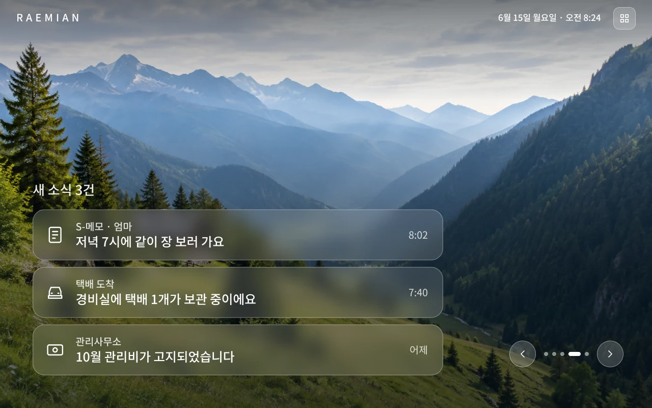
Split the interface into two modes
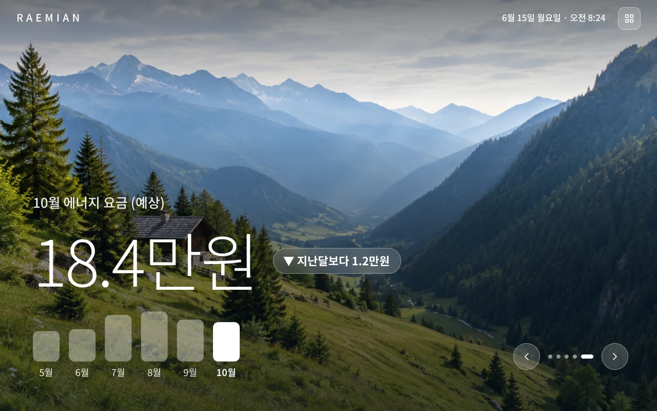
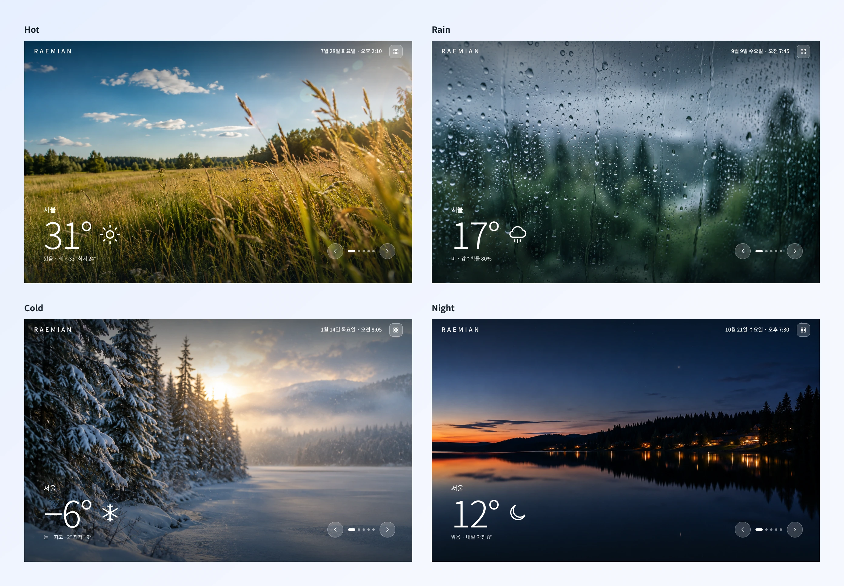
Why: Residents wanted capability without complexity. I separated the experience into an ambient standby display for everyday information, with large widgets and weather photography, and a structured menu for active control.
Trade-off: Detailed controls moved one step deeper, behind the menu. In return, the screen people see most of the day stays calm and fits the interior.
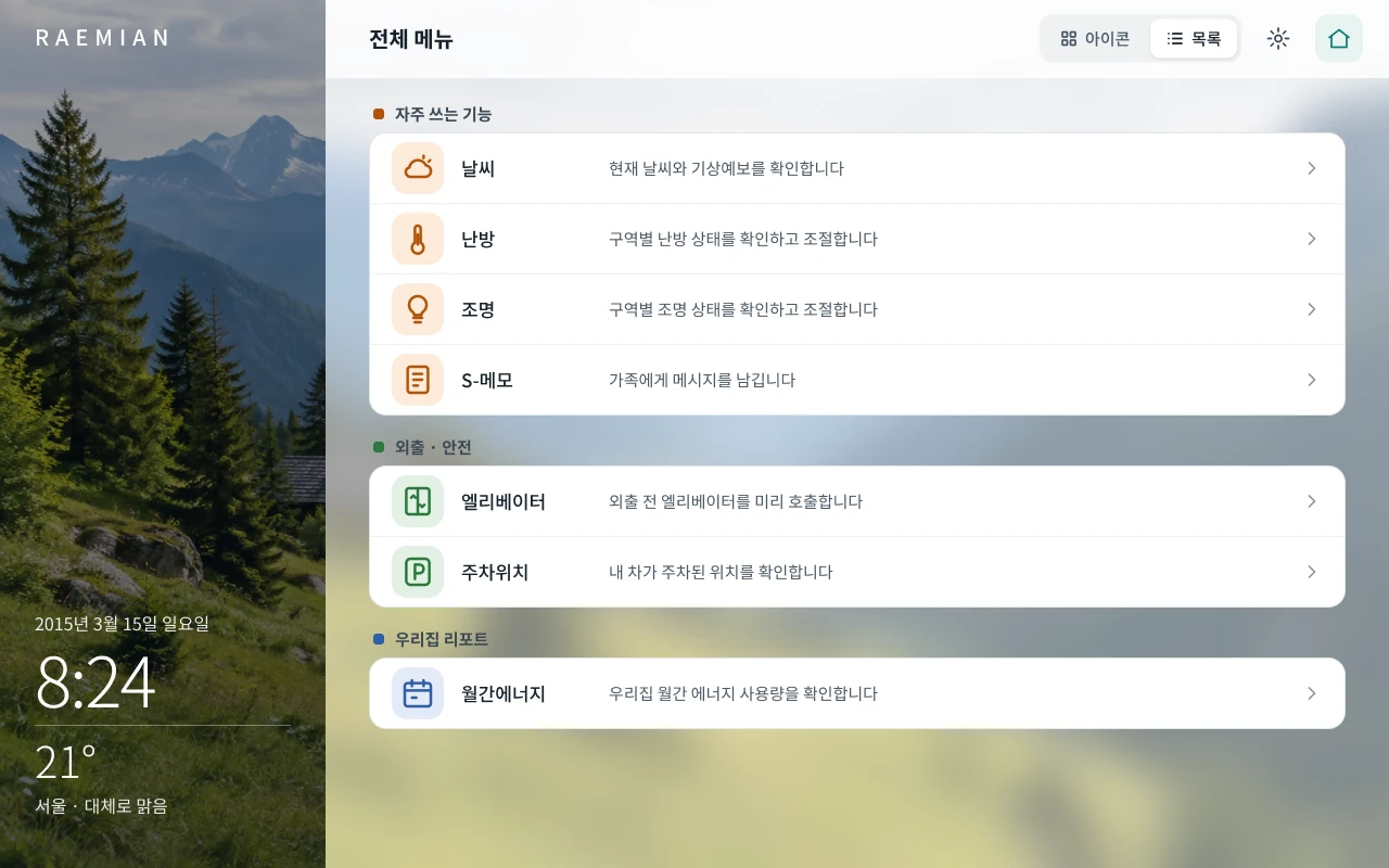
Regroup functions and standardise the icons
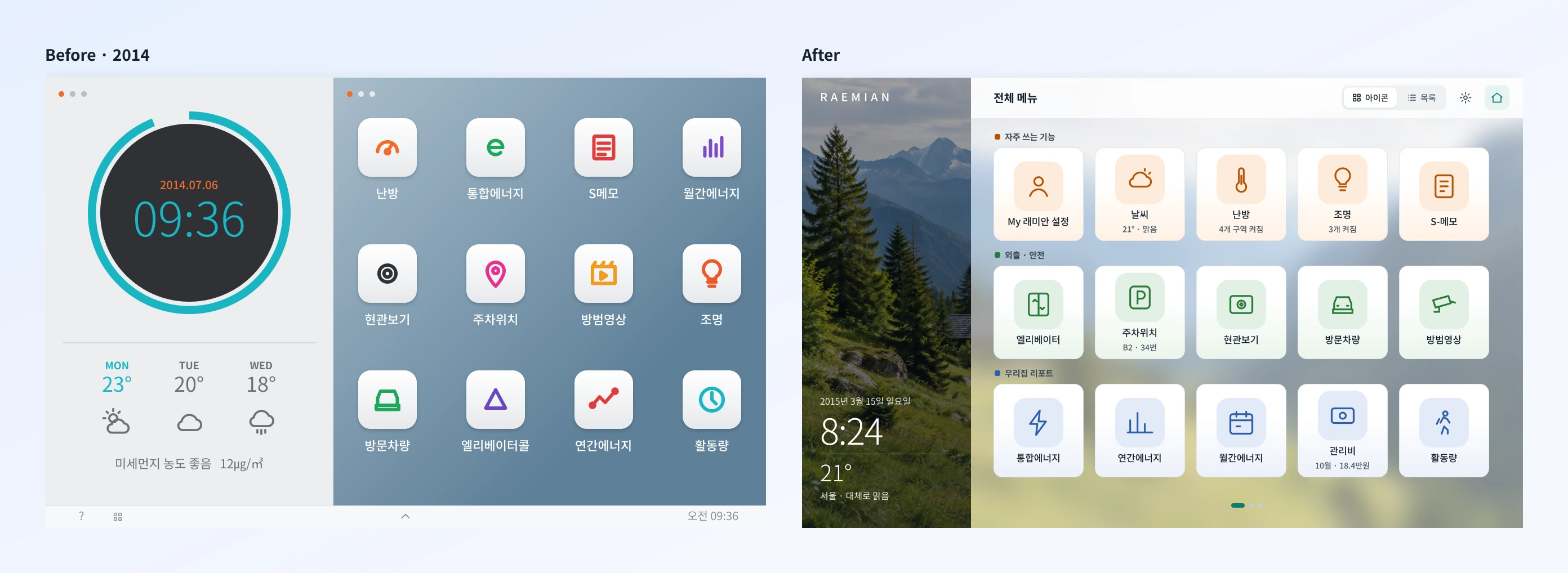
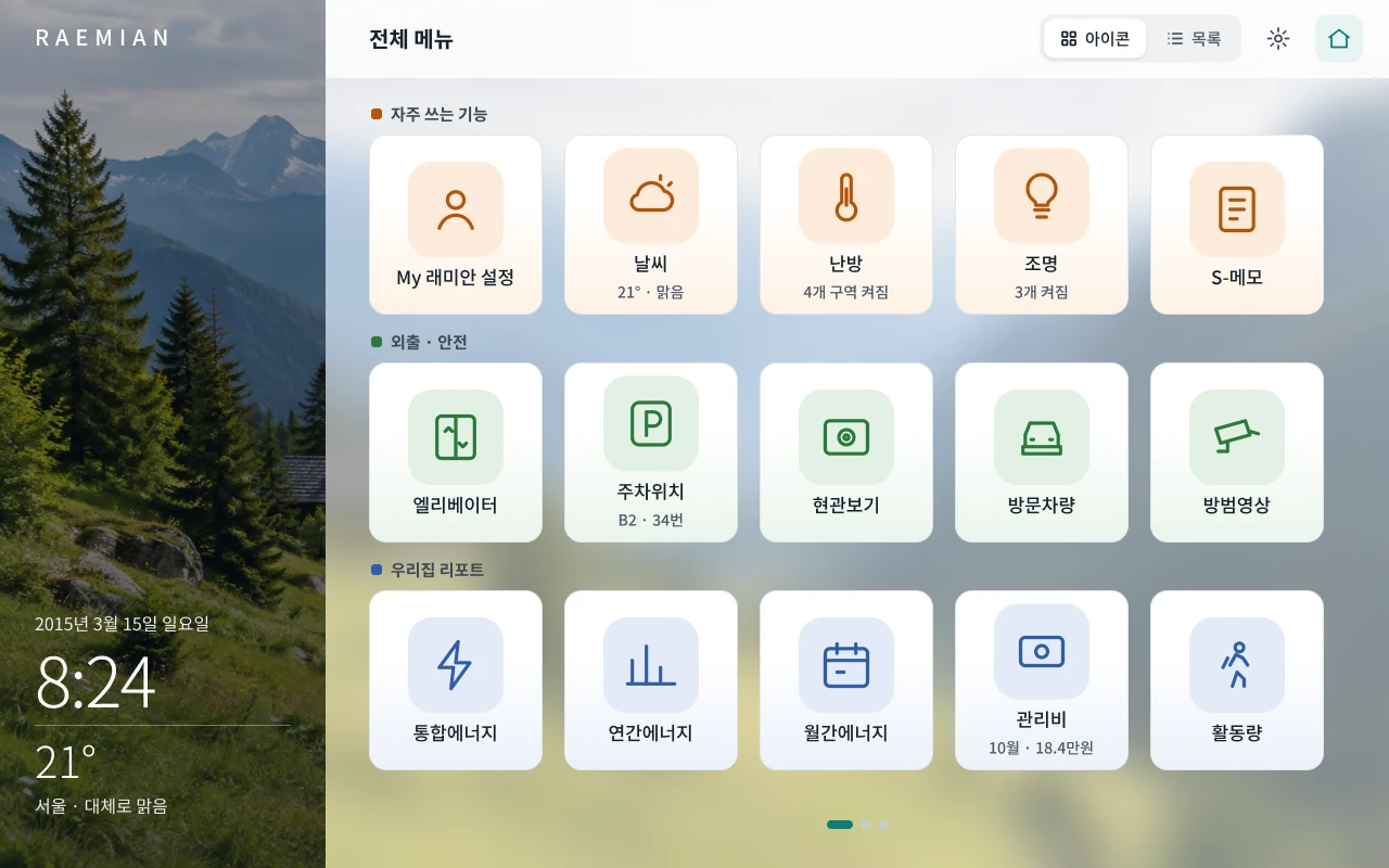
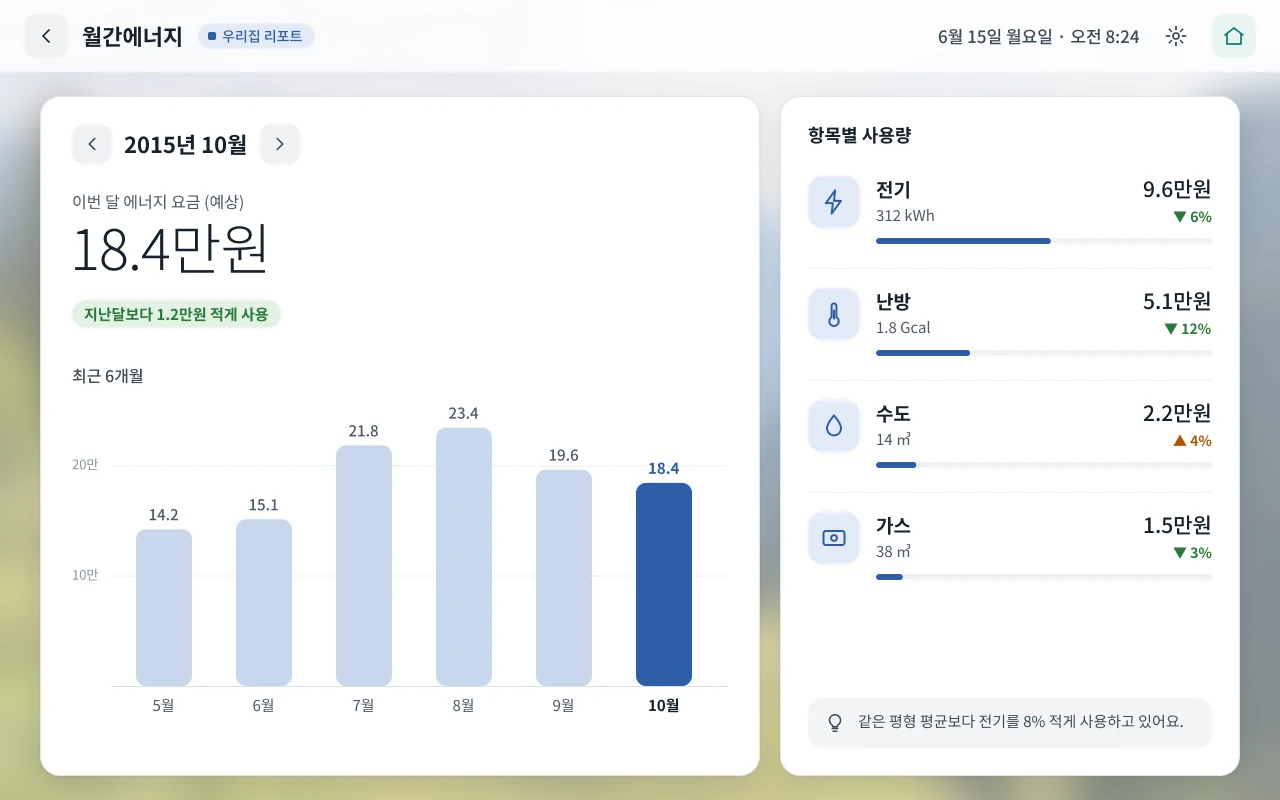
Why: Residents struggled to find and interpret controls. I reorganised functions into meaningful groups, standardised the icon language, and added short descriptions. When the menu opens, the widget shrinks to a side panel so time and weather stay visible.
Trade-off: Category colours reinforce the hierarchy, but only alongside labels and grouping. Colour never carries meaning on its own.
Offer both an icon grid and a list view
Why: One navigation format wouldn’t serve every resident equally. The grid gives a compact overview, and the list gives more explicit guidance.
Trade-off: Supporting both added interface complexity, but let residents choose how much explanation they need.
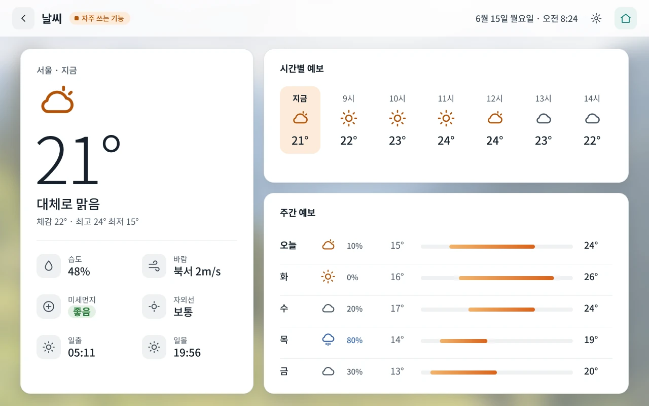
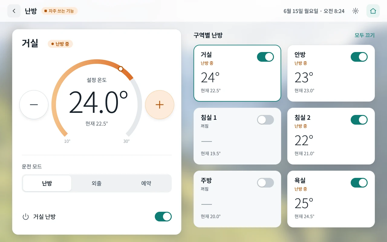
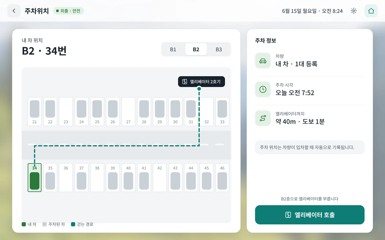
Keep one structure from menu to detail
Why: Every function opens into the same layout: a back button, the group it belongs to, and white cards over the softened home photo. Residents learn the pattern once and it carries across every function.
Trade-off: Some functions could have used a layout of their own. Consistency won, and each screen stays familiar even the first time a resident opens it.
Outcome
We tested with residents and recruited participants over several rounds, first on clickable prototypes and then twice on the real wall pad hardware. Most sessions ran in the model home. Participants completed timed tasks and thought aloud while we watched for task success, time, errors and hesitation. Interviews and questionnaires followed each session.
Each round showed improvement. Residents loved the modern look and feel, and found the features easy to use thanks to a cleaner organisation.
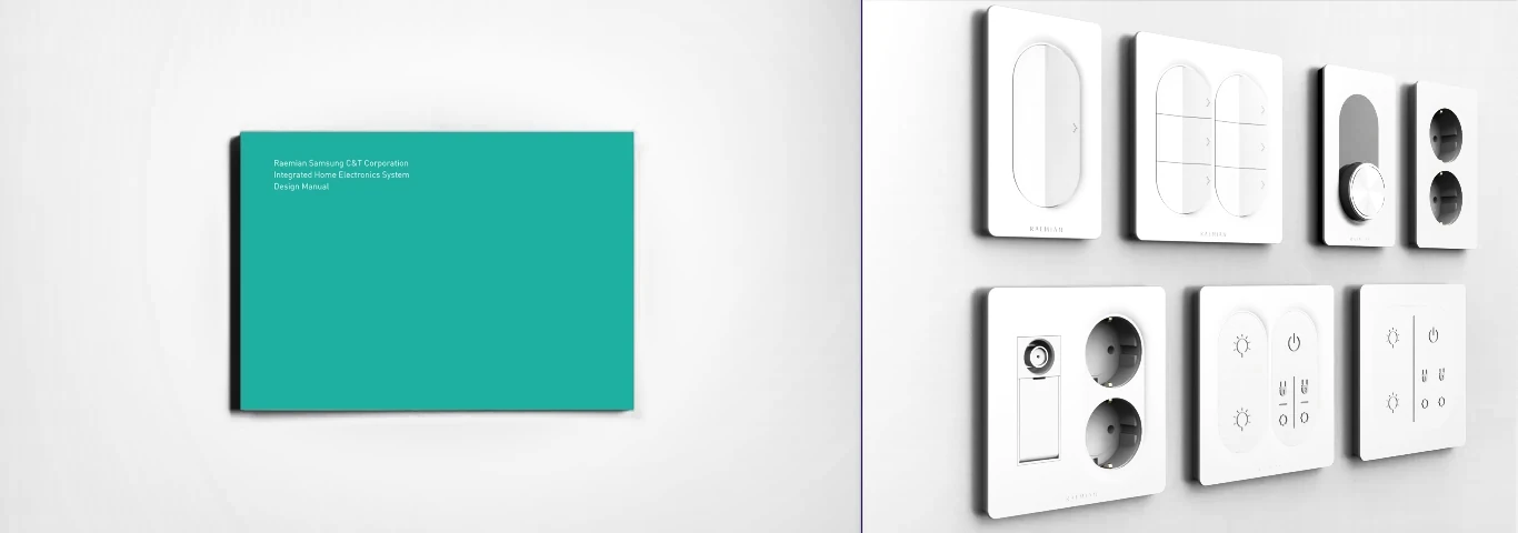
The final deliverables were the redesigned products, a research report and a design manual. The designs were implemented in Raemian apartments and reused in later Raemian projects. Samsung C&T registered the product family, including the wall pad screens, as a design in Korea.
Reflection
The premium feeling didn’t come from adding more. It came from restraint: showing the right information at the right moment, and keeping everything else one step away.
Testing in a real home setting also mattered. Small details like touch feedback shaped how residents judged the whole product.
Not everyone wanted a touch-only screen. Some residents asked for physical buttons for key actions, so later versions considered bringing them back. It was a reminder that a familiar control can matter more than a cleaner surface.