A shared design system
The product needed more than a style guide could give it. I started a design system beyond the original brief, built it alongside the product, and scaled it to a second product line.
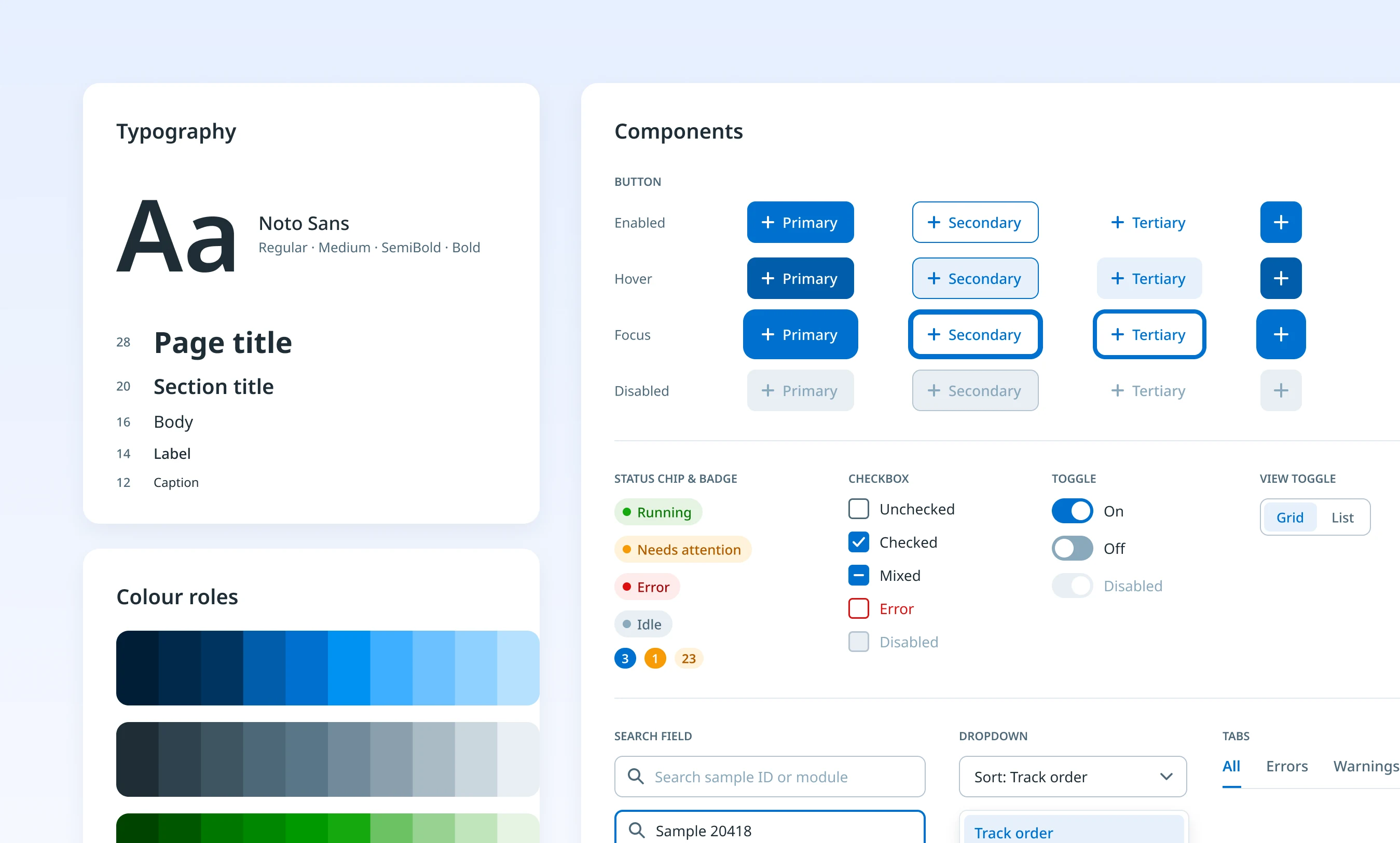
Figures on this page are reconstructions made for this portfolio, not original product screens.
The existing style guide covered basic visuals and only brief component states, with no usage guidance or sizing for new interfaces.
Initiated and owned a shared design system: tokens, components, a Storybook library and a contribution model with engineering.
Shared by two programmes and eleven applications. One analyser family with four models was released to customers in August 2026.
Context
A global life sciences company was building new lab automation software. The only guidance available was an embedded-software style guide with typography, colours, icons, a few components and brief states.
The company’s broader guidelines were made for e-commerce websites, not product interfaces. Neither could support the new applications. There was no design system, and engineering was already waiting.
The problem
How do you build a design system while the product it serves is still being designed?
As the sole designer at the start, I saw that delivering the product would need a real shared foundation: complete component states, usage guidance and sizing. That wasn’t in the brief. Design and engineering capacity was limited, the timeline was tight, and any change to a shared component could later affect several products.
To find out what people needed, I interviewed nine people one to one, across UX design, management, software engineering, product ownership and V&V, and ran a workshop.
What we heard
“Is this design ready to build? I can’t tell what’s final and what isn’t.”
“Isn’t the style guide enough? Can’t we start designing right away?”
“We need clear guidance on every state of a component, including the edge cases.”
“Can we build one system that works across programmes, based on our existing style?”
“Where do I start? What should I use?”
Everyone needed the same thing: one clear source of truth for what was ready, how it behaved, and how to use it.
My role
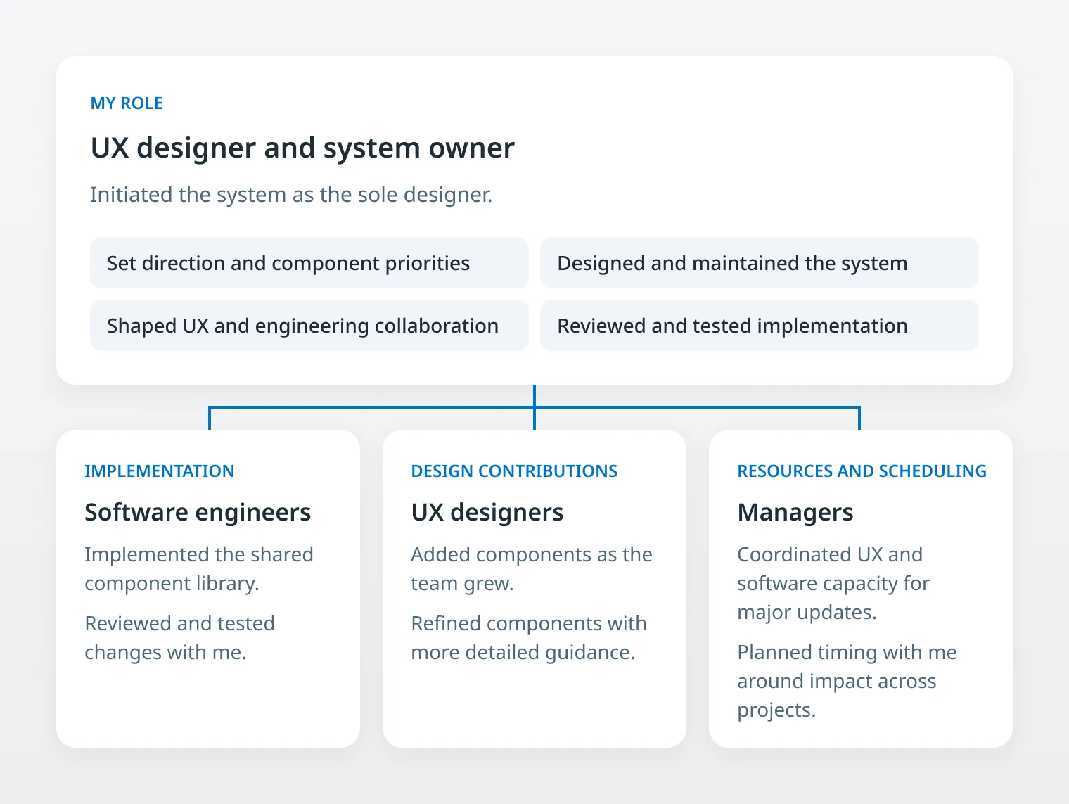
- Initiated the design system beyond the original brief, and owned it end to end
- Set its priorities, roadmap and design direction
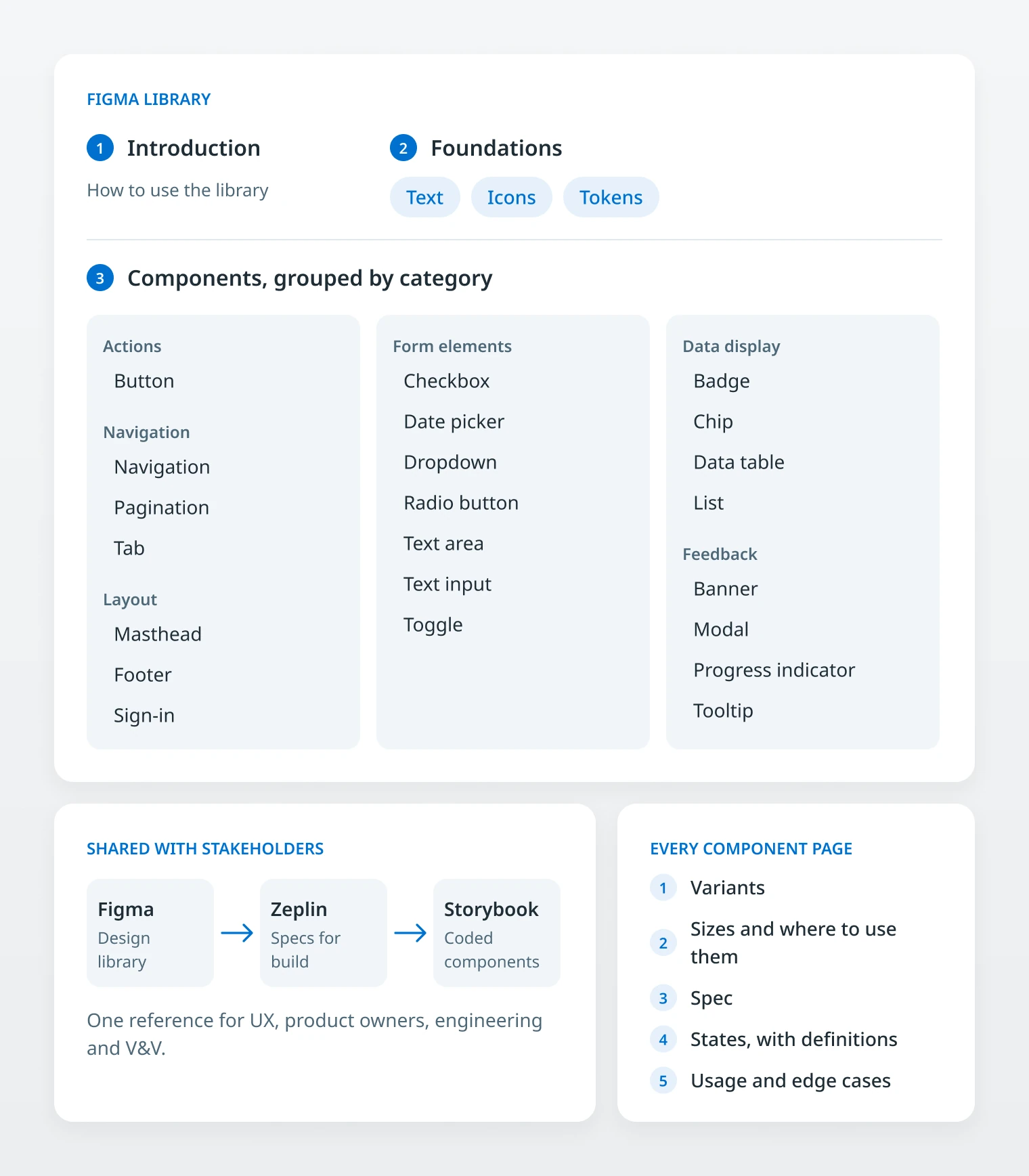
- Partnered with frontend engineers on a shared component library in Storybook
- Defined the collaboration model and contribution process between UX and engineering
- Introduced impact assessment for changes to shared components, coordinated with managers
- Reviewed implementation, and enabled other designers to contribute as the team grew
Key decisions
Make the case for a system nobody asked for
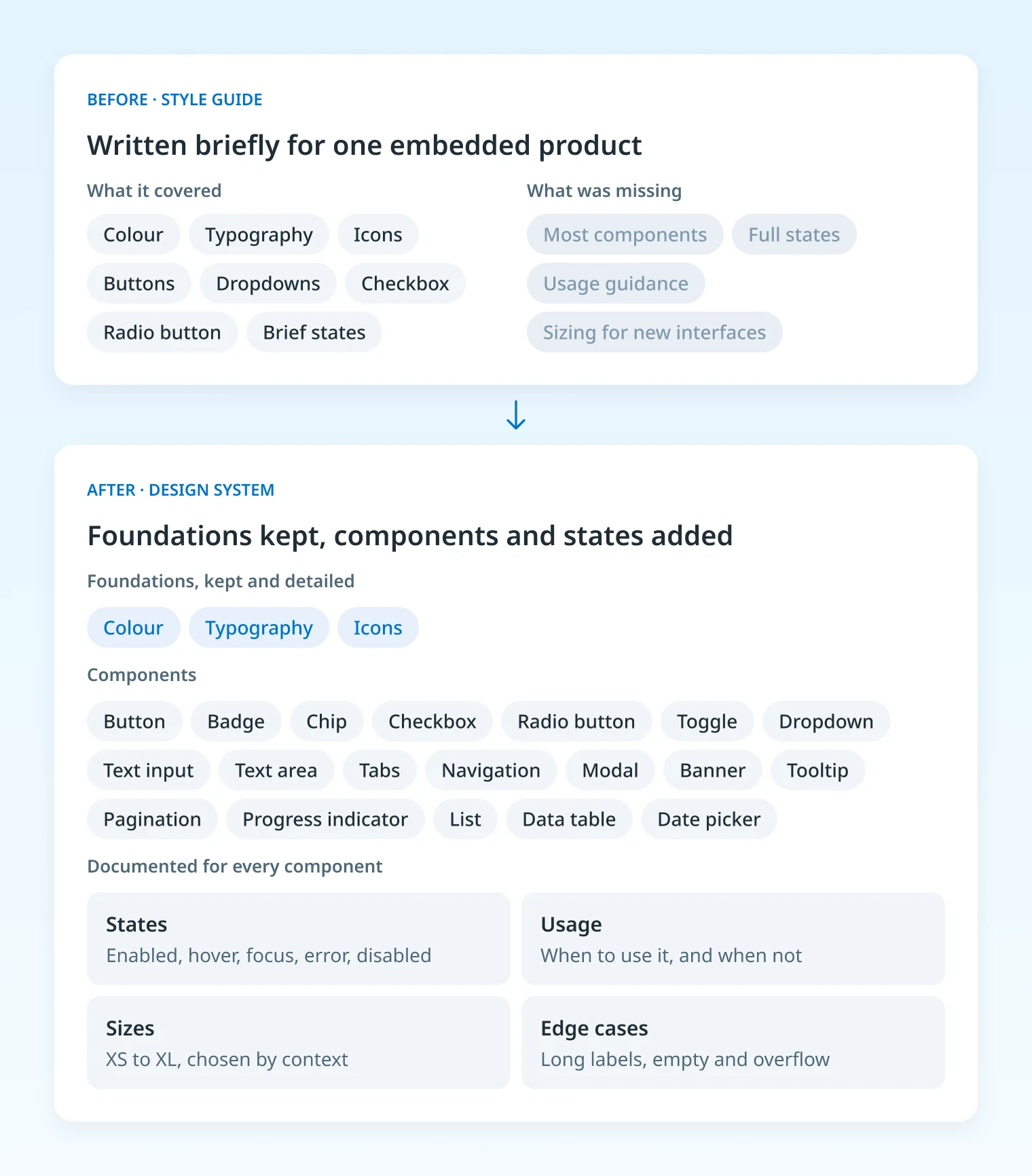
Why: Many on the team felt the existing style guide was enough to start. It had been written briefly for one embedded product: it had colours, type and icons, but many important components were missing and the states that existed were very limited. I showed the team exactly where it fell short and why it would not scale. I proposed keeping its foundations, so the design identity stayed, and building a full system on top of it, with a roadmap for how to get there.
Trade-off: It added work at the start of a tight schedule, and I had to earn buy-in before there was much to show. As the system grew, we also found contrast and sizing gaps in the original styles and refined the primary colour for accessibility. In return, the foundation was ready when the product grew.
Sequence components to match feature readiness
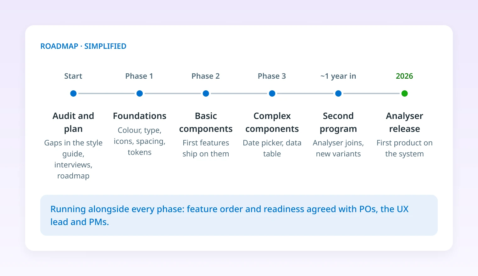
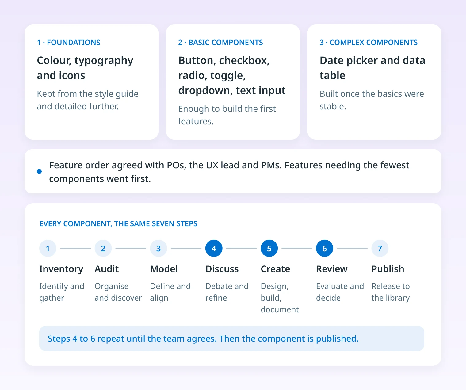
Why: Building everything at once was not possible. I detailed the foundations first, then the basic components, then the complex ones such as the date picker and table. The first product features were the ones that needed the fewest components, and I agreed feature order and readiness with the POs, the UX lead and the PMs.
Trade-off: Some features waited for the components they depended on. In return, engineering always knew what was ready to build. When a shipped component still needed iteration, we agreed the changes with engineering first, so nothing changed without the team knowing.
Use external components for complex controls
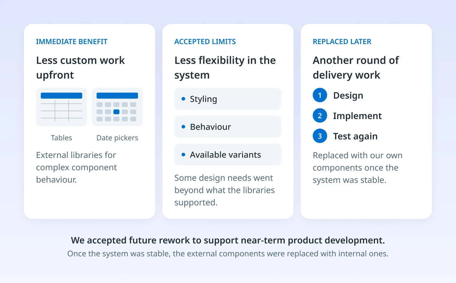
Why: Tables and date pickers need substantial engineering and testing. With limited capacity and a tight timeline, external libraries let product work move forward.
Trade-off: Less flexibility in styling, behaviour and variants, and replacing them later means another round of design, build and testing. We accepted that rework on purpose. Once the system was stable, we replaced the external components with our own.
Share the foundation, not every pattern
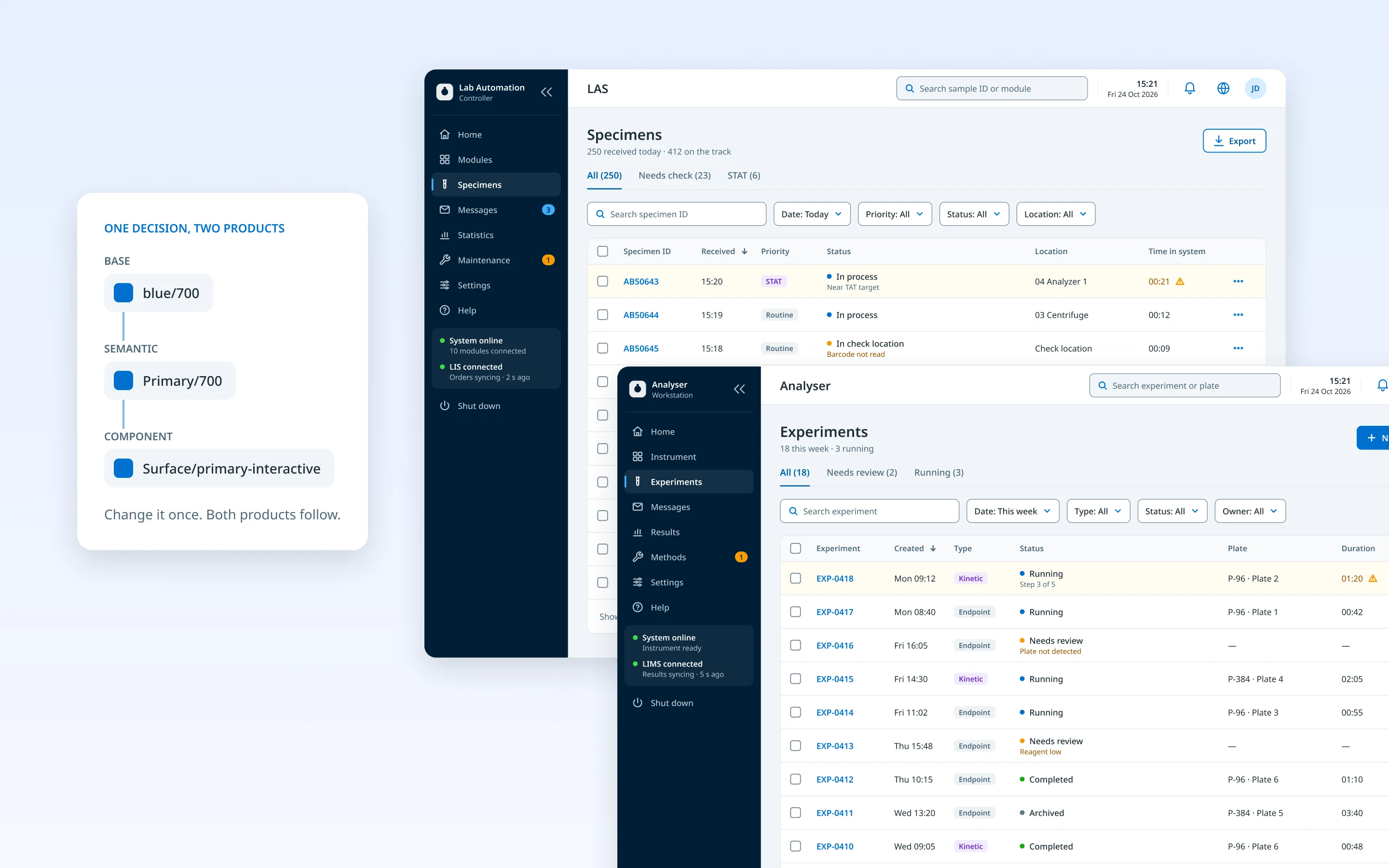
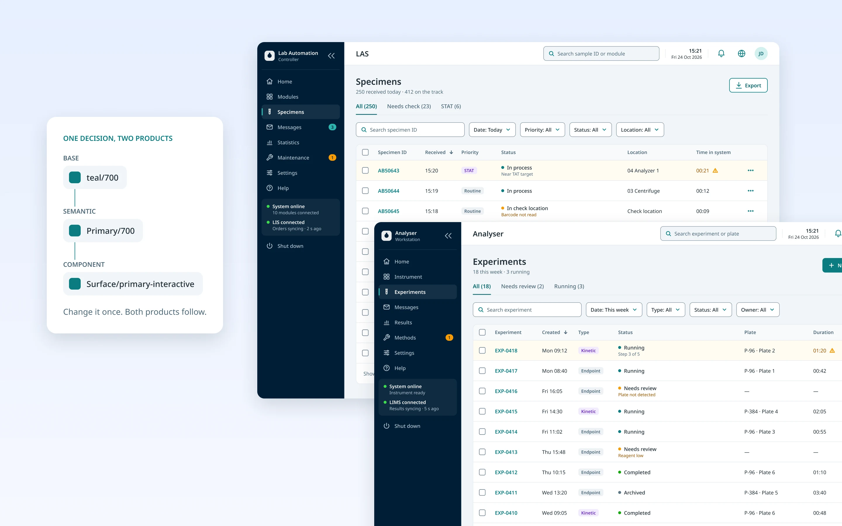
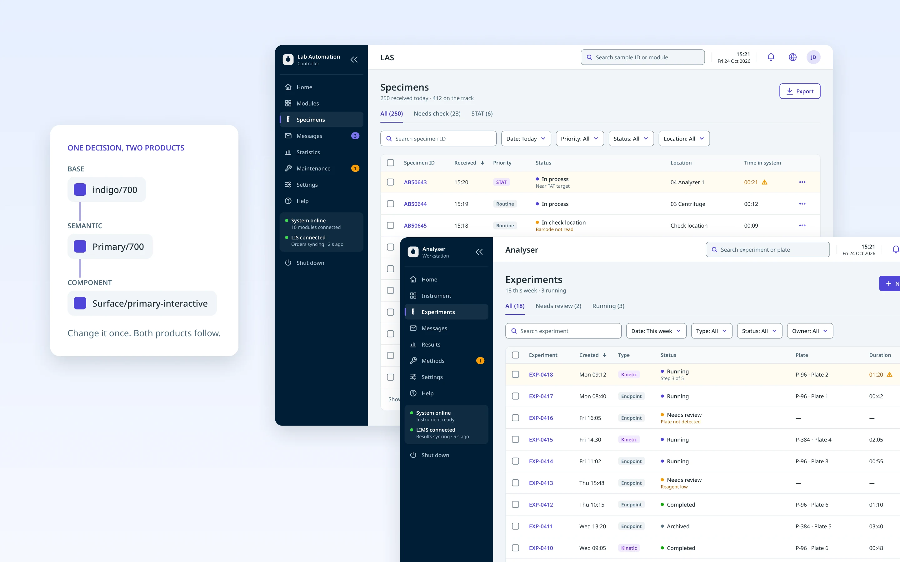
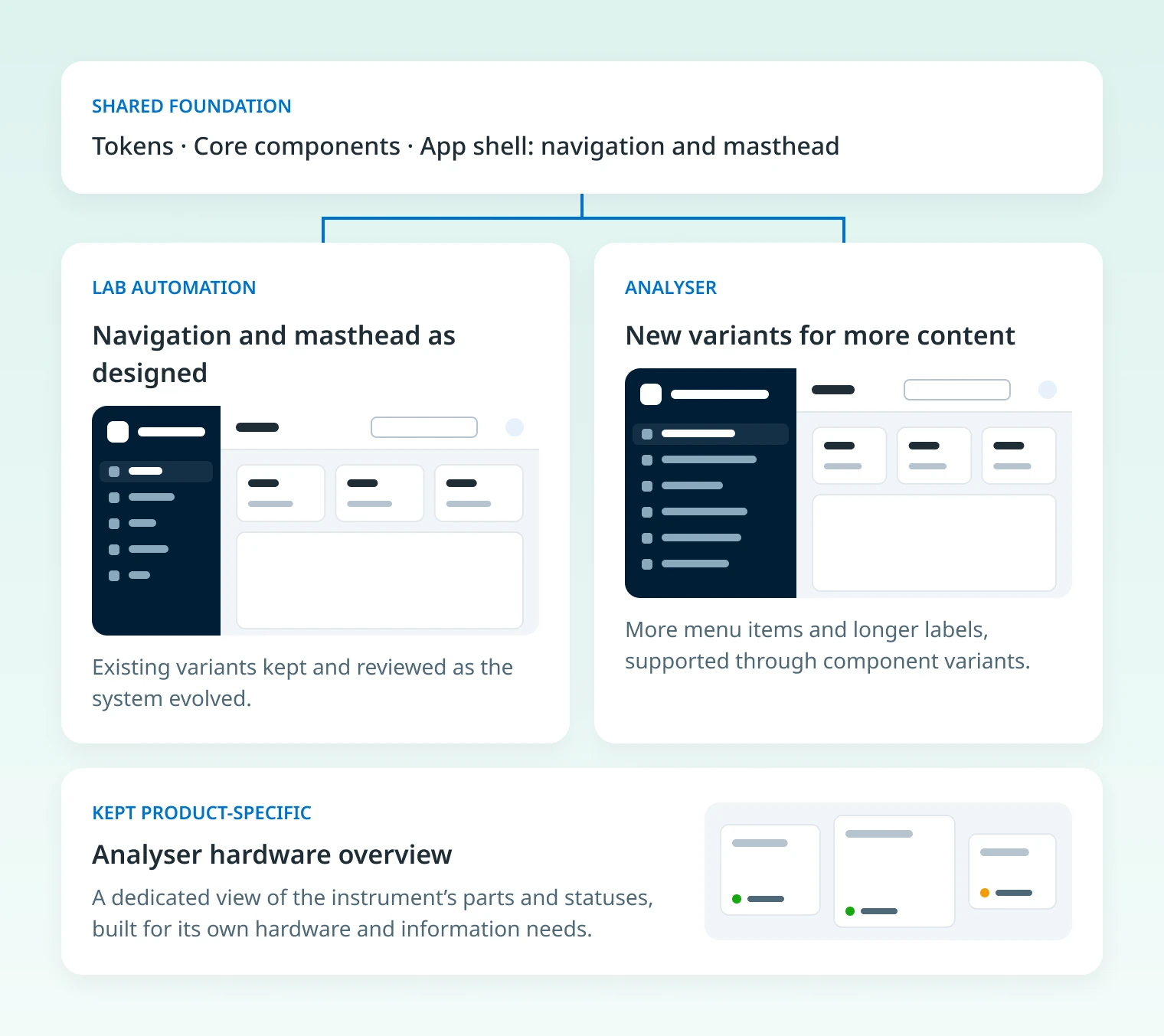
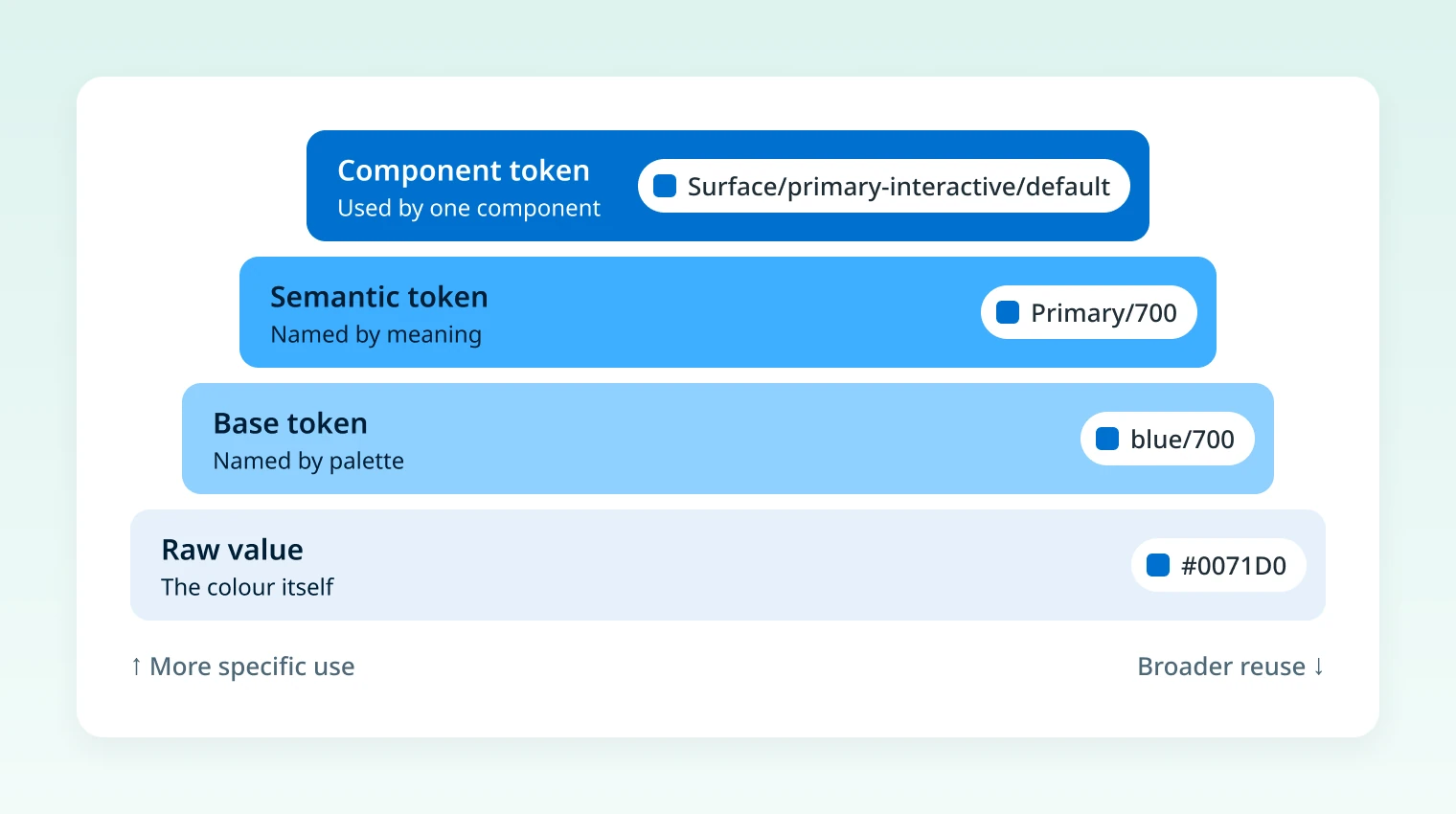
Why: About a year in, an analyser product joined with different needs: chemists building experiments, complex tables, longer labels and a hardware status view. I organised tokens into base, semantic and component layers, so products could share decisions while components adapted. Shared components like the navigation bar and masthead grew new variants.
Trade-off: The analyser’s hardware overview stayed product-specific instead of becoming a shared component. Less reuse, but the system stayed clean and each product kept what made it different.
Inside the system
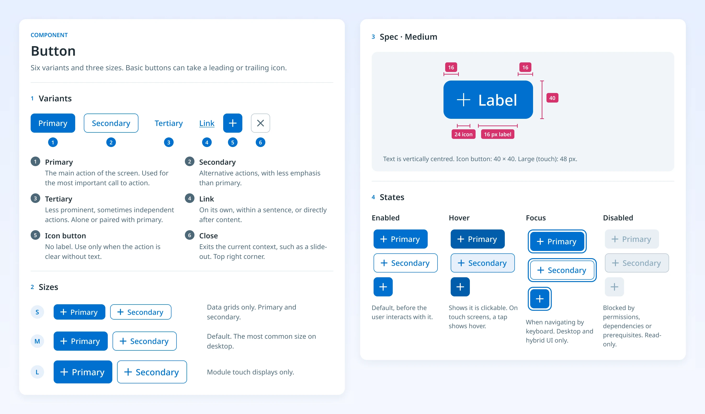
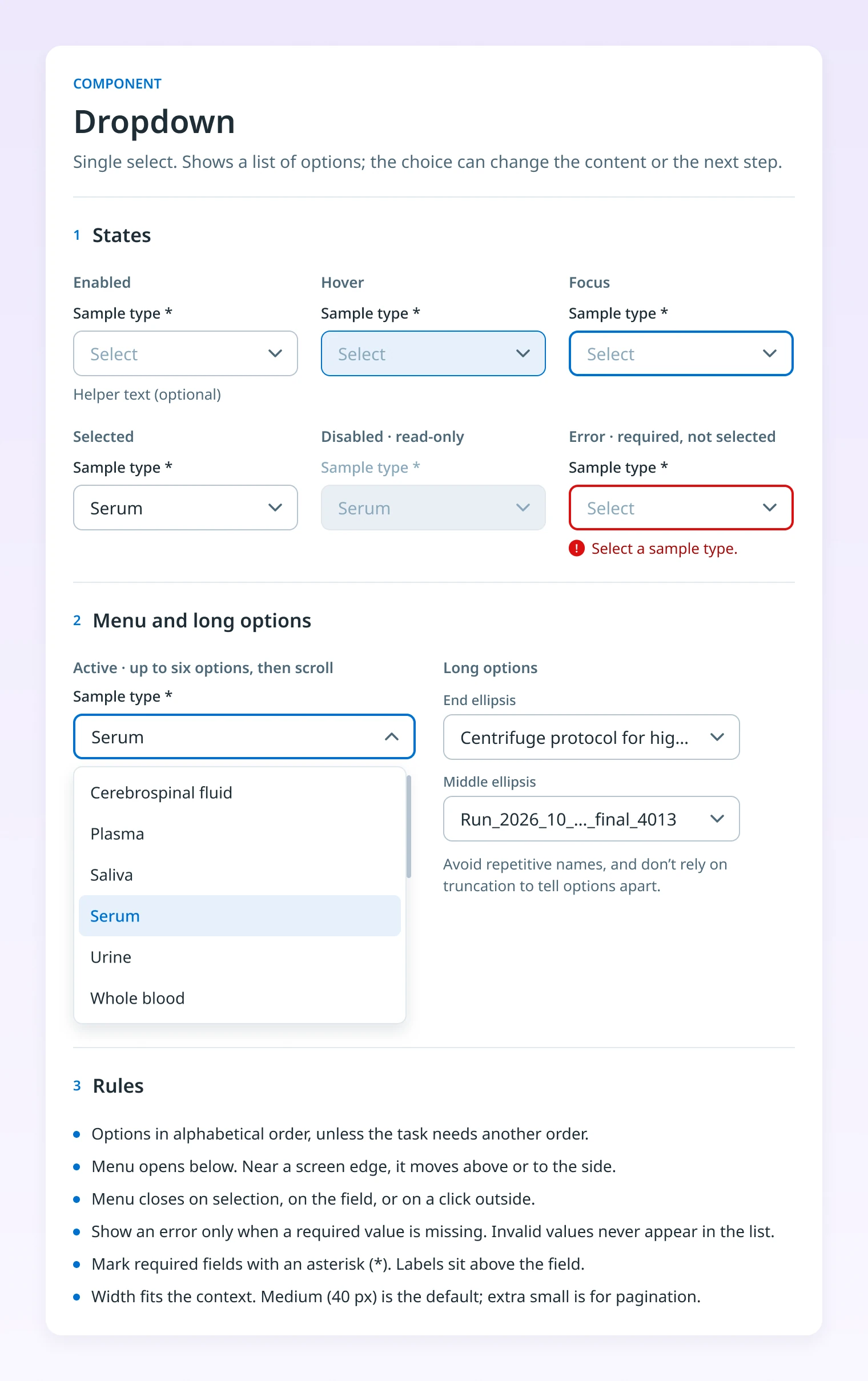
Every component had its own page: variants, sizes, specs, states and usage rules. Designers, engineers and V&V worked from the same source.
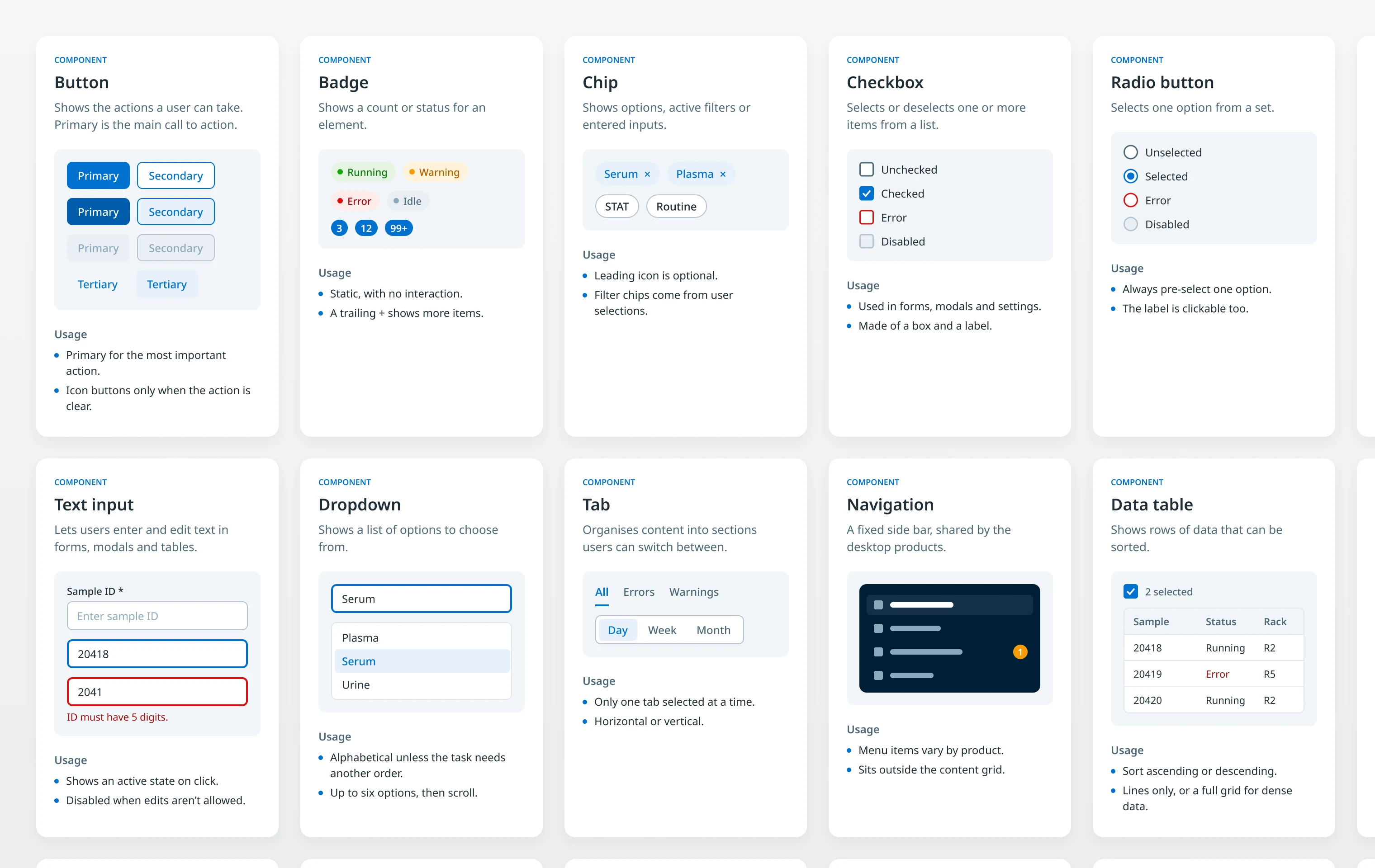
Example: Button
Example: Dropdown
Accessibility
Components were checked against WCAG for colour contrast, keyboard access, visible focus and touch target size. We checked all text against contrast requirements. The original primary colour failed, so I updated it for action buttons and all main actions. Every function could be operated by keyboard, with a visible focus indicator. Body text stayed at 14 px or larger for readability.
Text input was kept out of the MVP. The module displays were small touch screens mounted on the hardware, too cramped for comfortable typing, and the desktop apps used keyboard, mouse and barcode scanner. An on-screen keyboard, which would need nine languages and had no design yet, moved to the roadmap.
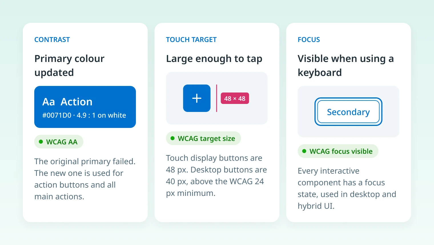
Pages rebuilt for this portfolio from the original documentation. Sample content is illustrative.
Outcome
Once the foundation stabilised, designers assembled new interfaces from existing components, and engineers reused implementations instead of building from scratch. Day to day, both programmes moved faster.
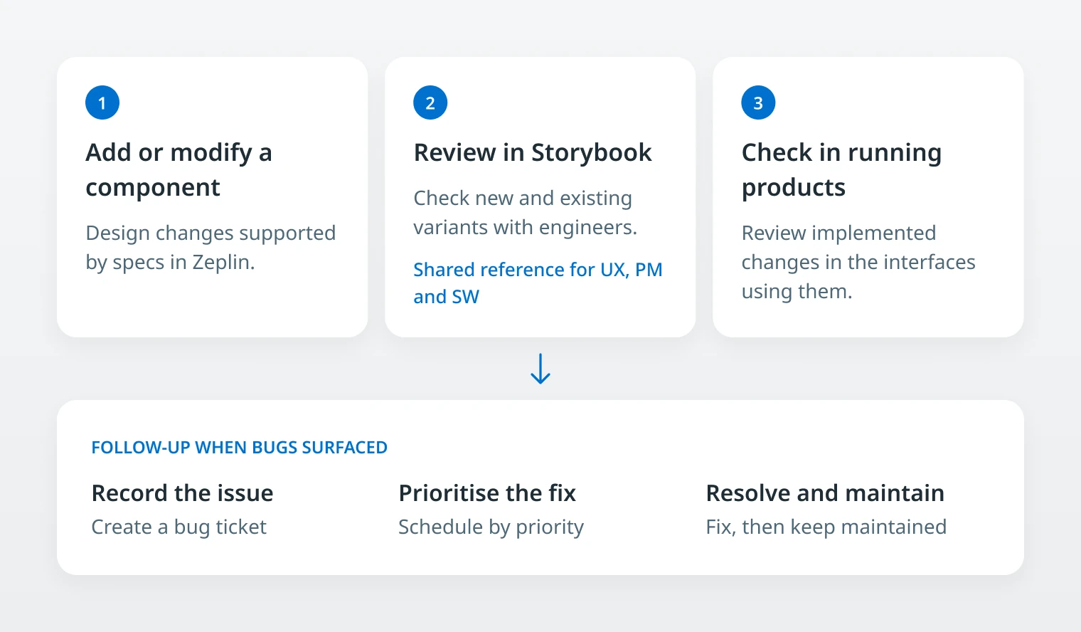
Storybook became a shared reference for UX, product management and engineering, which made design discussions more concrete and helped new designers onboard and contribute sooner.
Reflection
A design system is a product, not a deliverable. It needed ongoing ownership: reviewing variants, following up on bugs and weighing every change against the products already using it.
Temporary components also come with a cost: replacing them took another round of design, build and testing. Next time, I would put those dependencies on the roadmap from the start: the limitations we accept, what would trigger the replacement, and the cost of changing course.